

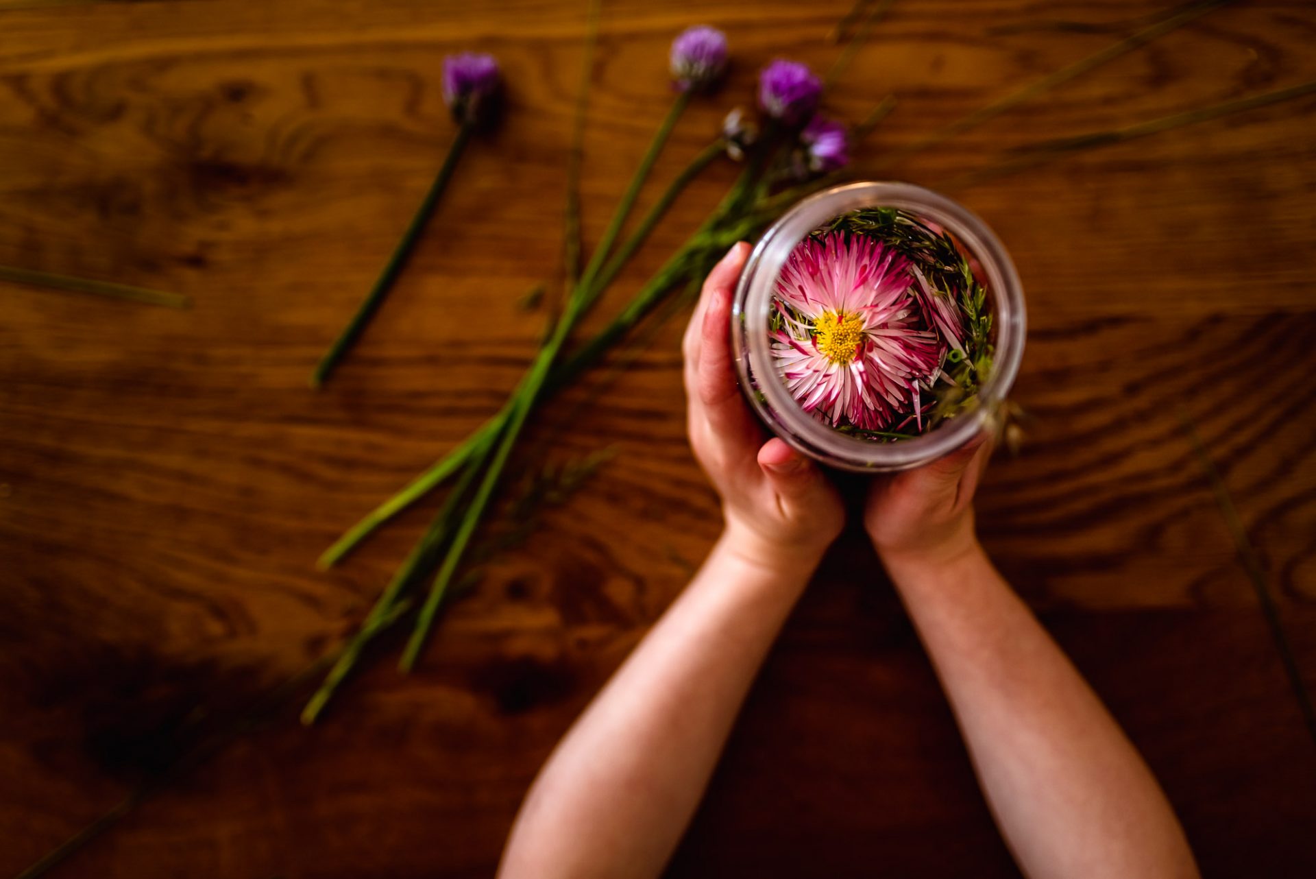
You’ve taken a great photo. So it’s time to share it on your social media and with your family.
Wait!
I want you to spend a couple of minutes making some adjustments first.
Editing might seem like a specialist skill, but we’ve all gotten used to playing with our photos.
We all know how to apply a filter thanks to Instagram and built-in presets on our phone. There’s nothing wrong with using these filters but always edit your photo first to make it look even more awesome!
I’m going to cover the basics to give you a better understanding of what all the different options mean and what they do to your image.
I recommend using one of these free apps to edit your photos. These will give you access to more tools and allow you to make even more adjustments to your image:
Lightroom
This is a really powerful piece of editing software that lets you edit and share photos on your iPad, iPhone or Android device. The app is available for Android and iPhone.
Pixlr E
What I love about Pixlr is that it offers essentially a cut-down Photoshop right in your browser. Use the online version if you’re using a DSLR or once you’ve got photos from your phone onto your computer.
Many of the options I’m going to cover below are also available on your phone.
Let’s start editing…
1. Exposure
Is your image too dark or bright?
Look at your subject and make adjustments to the exposure accordingly.
You’ll find exposure under the ‘Light’ section in Lightroom and ‘Adjust – Light’ in Pixlr.
Don’t be too heavy-handed. If you brighten it too much you will blow your highlights (the brightest areas with the most light hitting them). Look out for shiny bright white areas with no detail in them, that means you’ve gone too far.
When you increase the exposure you’ll notice your colours aren’t so vibrant. Don’t worry, we’ll correct this later when we make some colour adjustments.


2. White Balance
White balance is the colour temperature of the light. I promise I’m not going to get too technical, I appreciate I might be the only Kelvin (colour temperature) geek out there.
Your phone/camera doesn’t always get the temperature of the light correct so you’ll need to make adjustments to help achieve good skin tones.
If your photo is too cold it will look blue. Fix this by adding some yellow (slide to the right) to warm it up. And if it’s too warm/yellow, add some blue (slide to the left) to cool it down.
The white balance adjustment is under ‘Colour’ in Lightroom and ‘Adjust – Colour’ in Pixlr. Use the temperature slider to fine-tune your white balance.
But there’s one more thing to adjust and that’s the tint.
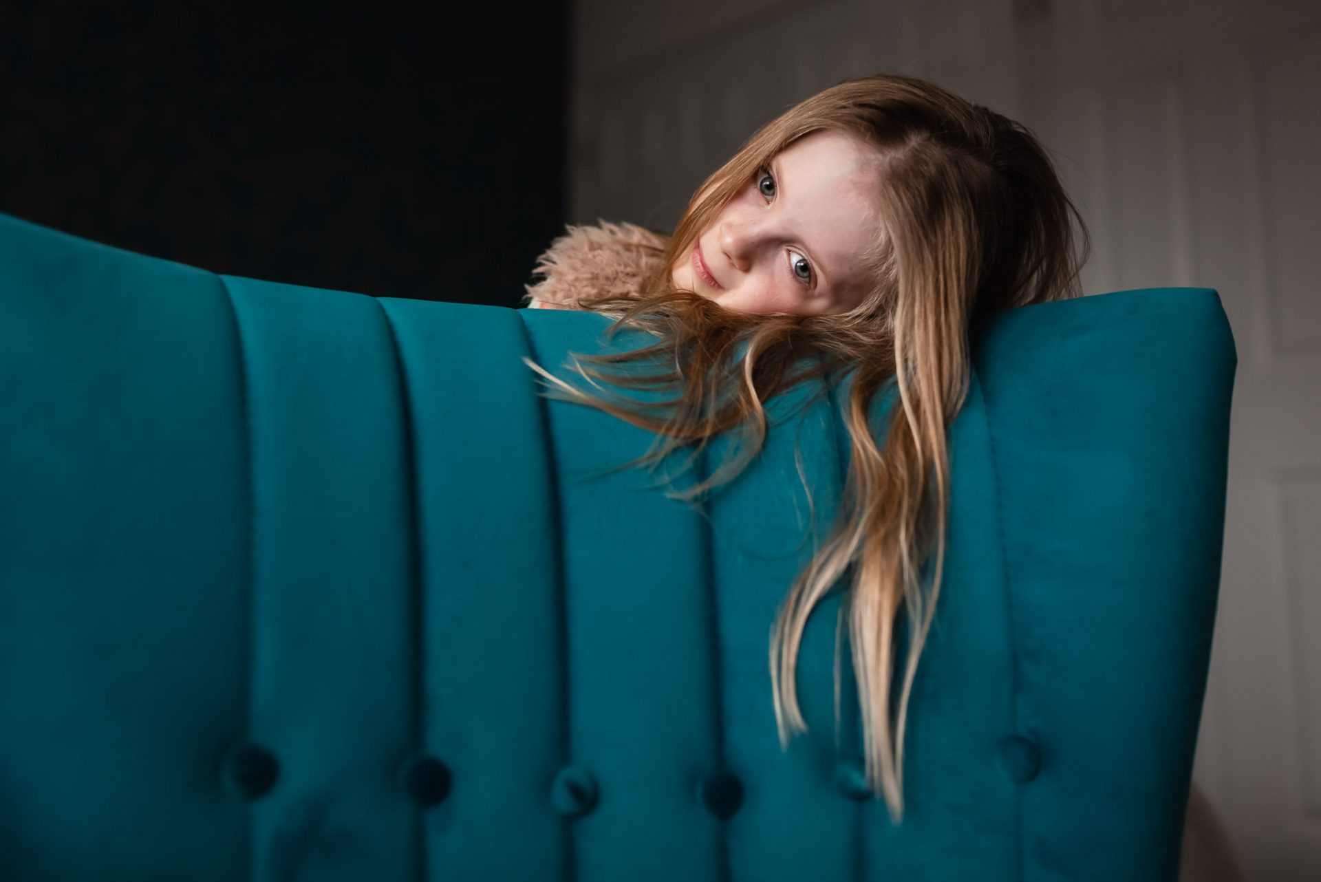
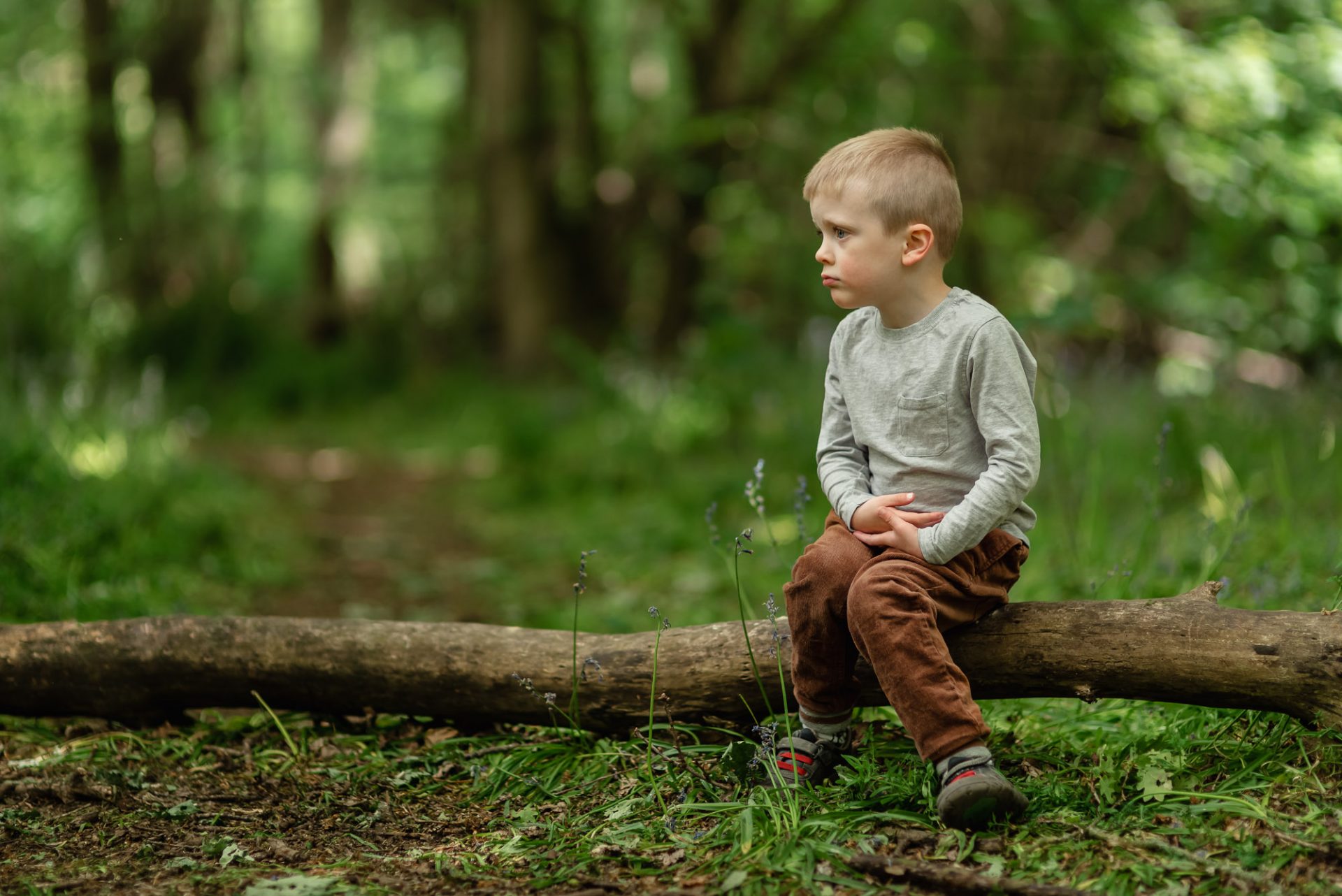
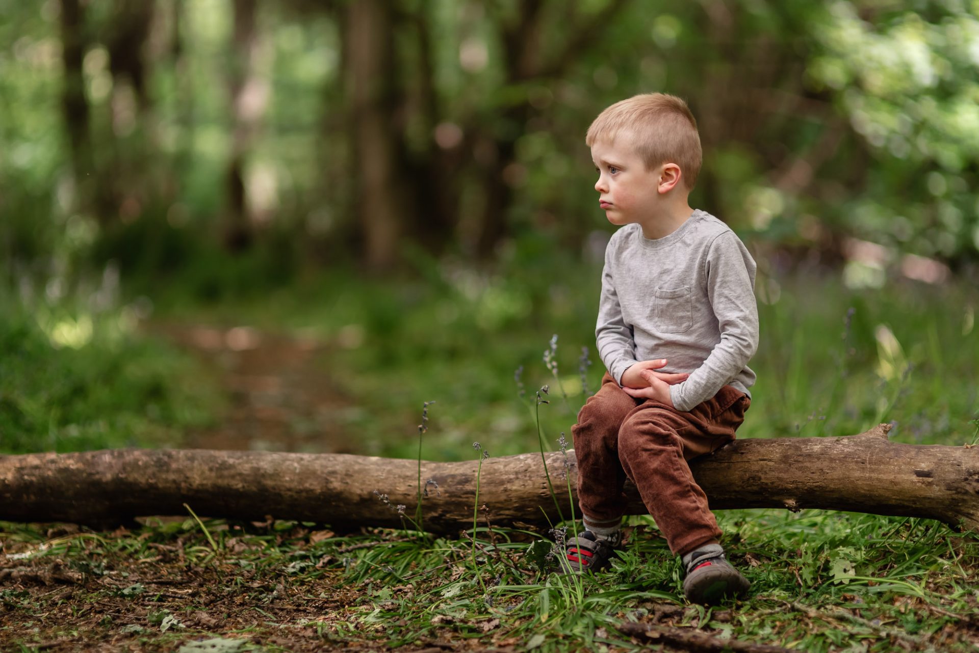
How many of you have taken photos in the woods recently and noticed your child’s skin looks really green? It’s unavoidable, and believe me when I say, there’s a lot of editing that goes on behind the scenes of any bluebell photo shoot.
When the light is reflected off a coloured surface it will create a colour cast on your subject’s skin, especially if your little ones are as fair-skinned as mine. Grass and trees are a major culprit when shooting outdoors.
And this is where the tint slider comes into play.
You can reduce green colour casts by adding some magenta. This isn’t a magic wand and it’s not going to remove it completely but you should see a difference.
3. Blacks & Shadows
Blacks refer to the darkest areas with no details in them. If you move the black slider to the left you’ll increase the level of darkness, and if you pull them up you’ll create a faded look.
Personally, I like a more moody edit and I bring my blacks down a little. Have a play around and find the right balance for your photo.
Unlike the blacks, the shadows still retain details in them. If your image is underexposed (too dark) bringing the shadows up can help to brighten your image. Try bringing the shadows down for a more dramatic look.
These adjustments are under the ‘Light’ section in Lightroom and ‘Adjust – Light’ in Pixlr.
4. Whites & Highlights
The white slider changes the white point in your image. If you move it to the right you are basically making the brightest areas of your image even whiter. You’re more likely to want to move this slider to the left and decrease the whites – this is particularly useful if you have a backlit image and the background is really bright.
The highlights slider targets just the highlights in your photo. If they’re too bright, pull them down a touch or brighten them by pulling the slider up a little. Just keep an eye out for any blown-out areas.
These adjustments are under the ‘Light’ section in Lightroom and ‘Adjust – Light’ in Pixlr.
5. Contrast
Increasing the contrast will add depth to your photo. Your shadows will become darker and the highlights will appear brighter.
Try decreasing the contrast if you’re looking for a more dreamy look.
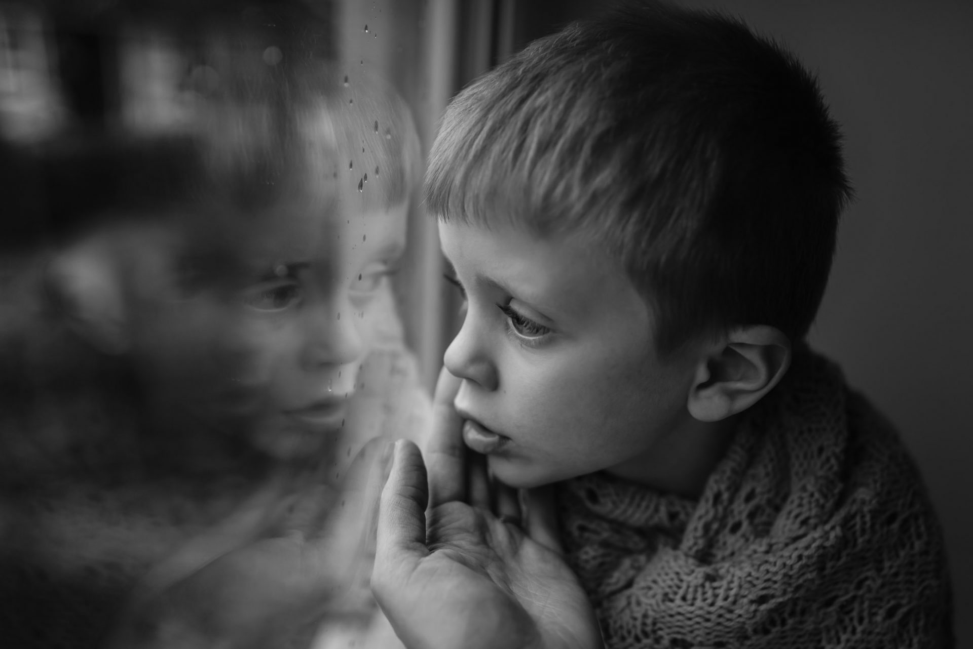
Contrast is a must when working with black-and-white images (in my opinion). You’ll get a lovely bold edit by cranking the contrast up.
Contrast is under the ‘Light’ section in Lightroom and ‘Adjust – Light’ in Pixlr.
6. Colour
There are a couple of things you can do to adjust the colours in your photo.
First is saturation. Saturation enhances/decreases (depending on which way you slide) the intensity of every colour in your photo. I never increase the saturation for that reason, it will make skin appear very orange.
Vibrance is the one I recommend using. Unlike saturation, this only enhances colours that are more muted. The good thing about vibrance is it doesn’t affect skin tones in the same way that saturation does – not if it’s used lightly anyway!
Adding some vibrance can really help if your colours need a little boost


Saturation and vibrance are under ‘Colour’ in Lightroom and ‘Adjust – Colour’ in Pixlr.
7. Composition
First thing to do is straighten your image. I’m a wonky photographer. I don’t use a tripod when I shoot with my big camera and I’m terrible with a camera phone (seriously bad).
Take a look at your photo and make sure your lines and subjects eyes are straight.
Now crop it. Or don’t, it’s completely up to you.
This is always the final step for me. I like to make all my other adjustments first. Ideally, you compose your photo in camera, but cropping can fine-tune this.
Here are a few cropping tips:
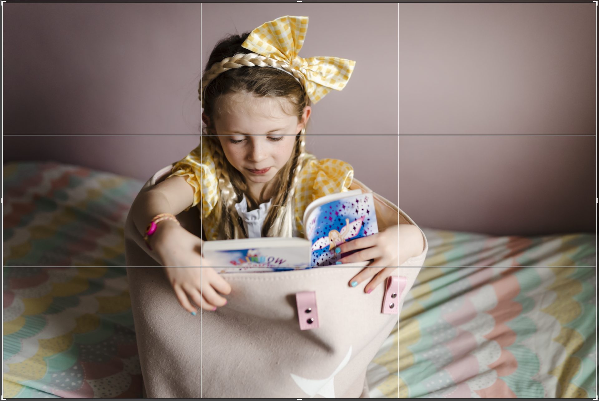
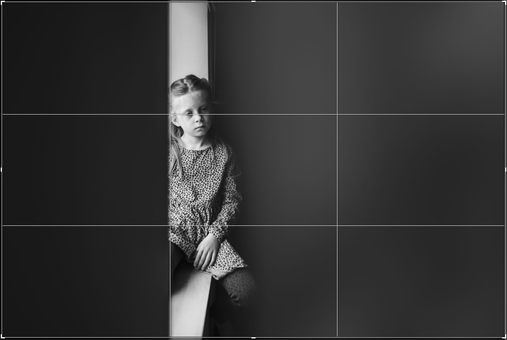
Use the rule of thirds
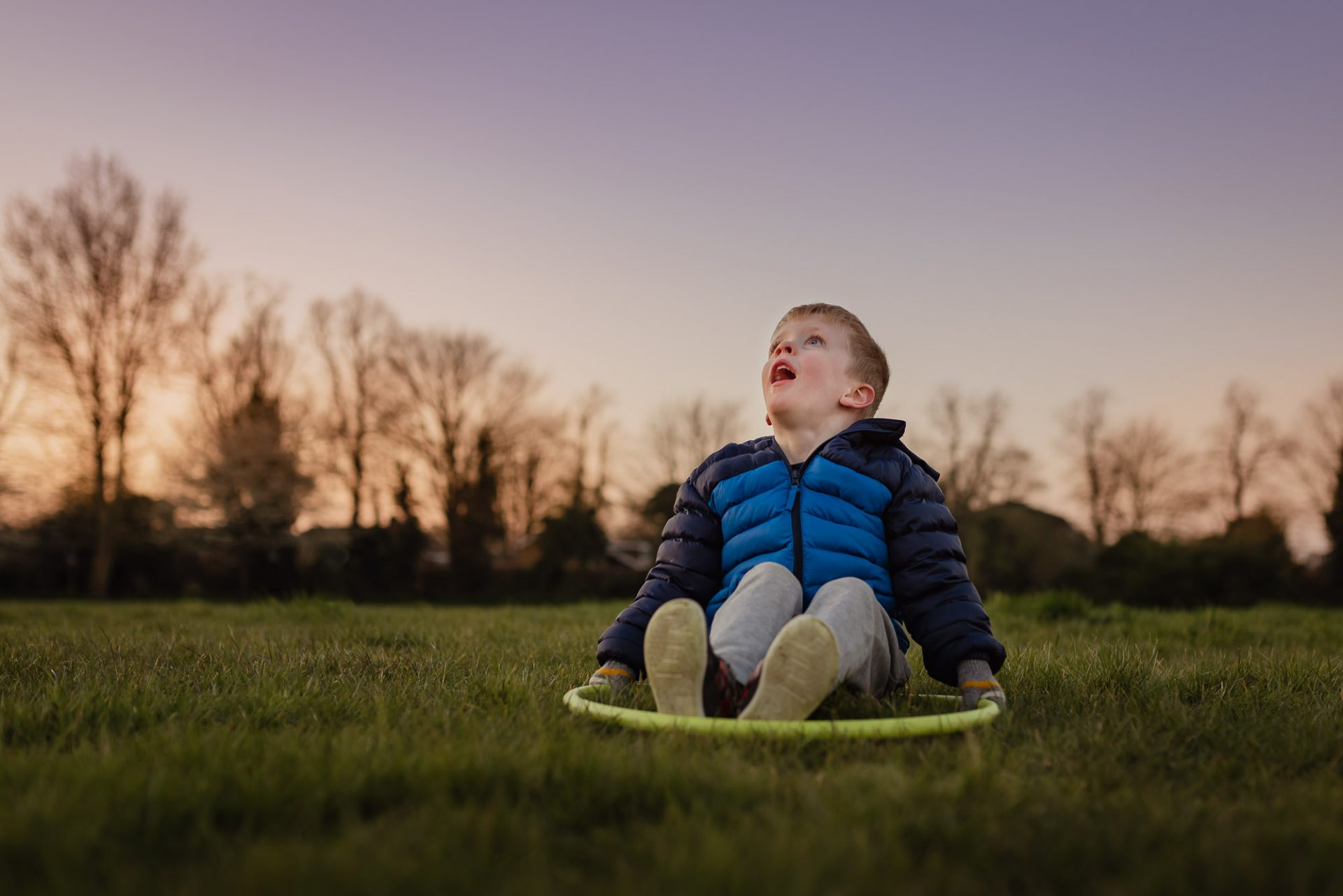
The rule of thirds grid should appear on your screen when you use the crop tool. The horizontal and vertical lines make up 9 equals sections. You should place your subject on one of the lines or where the lines meet.
Remove any distractions in your frame
If there’s a tree or bin, or anything that doesn’t add to the story behind your photo, get rid of it if you can.
Don’t limb chop
I want to see those little fingers and toes. You can get away with it on the thigh, shin, upper arm/lower arm, just don’t crop at the joint if possible.
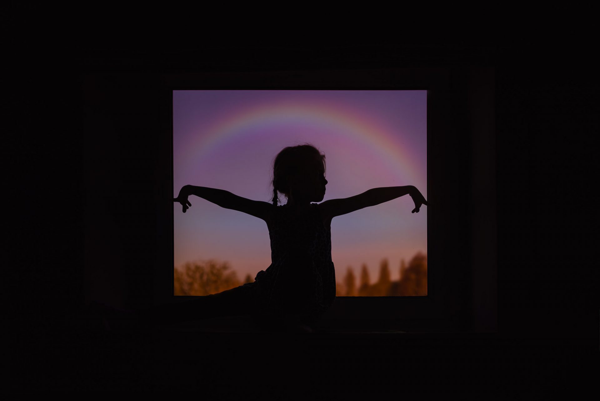
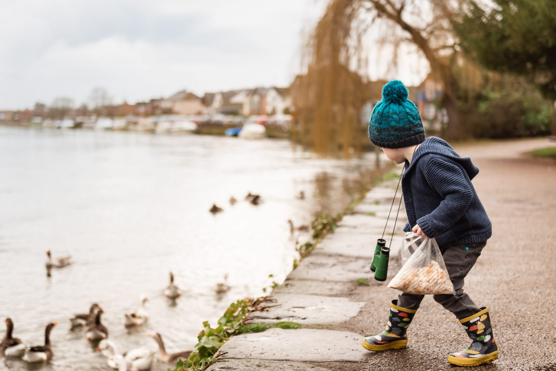
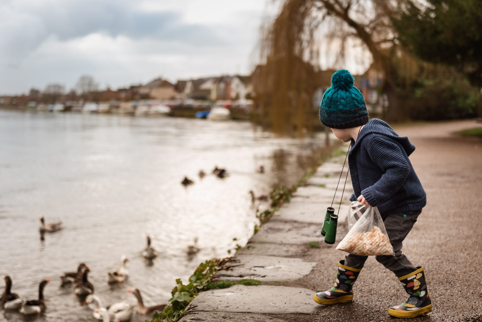
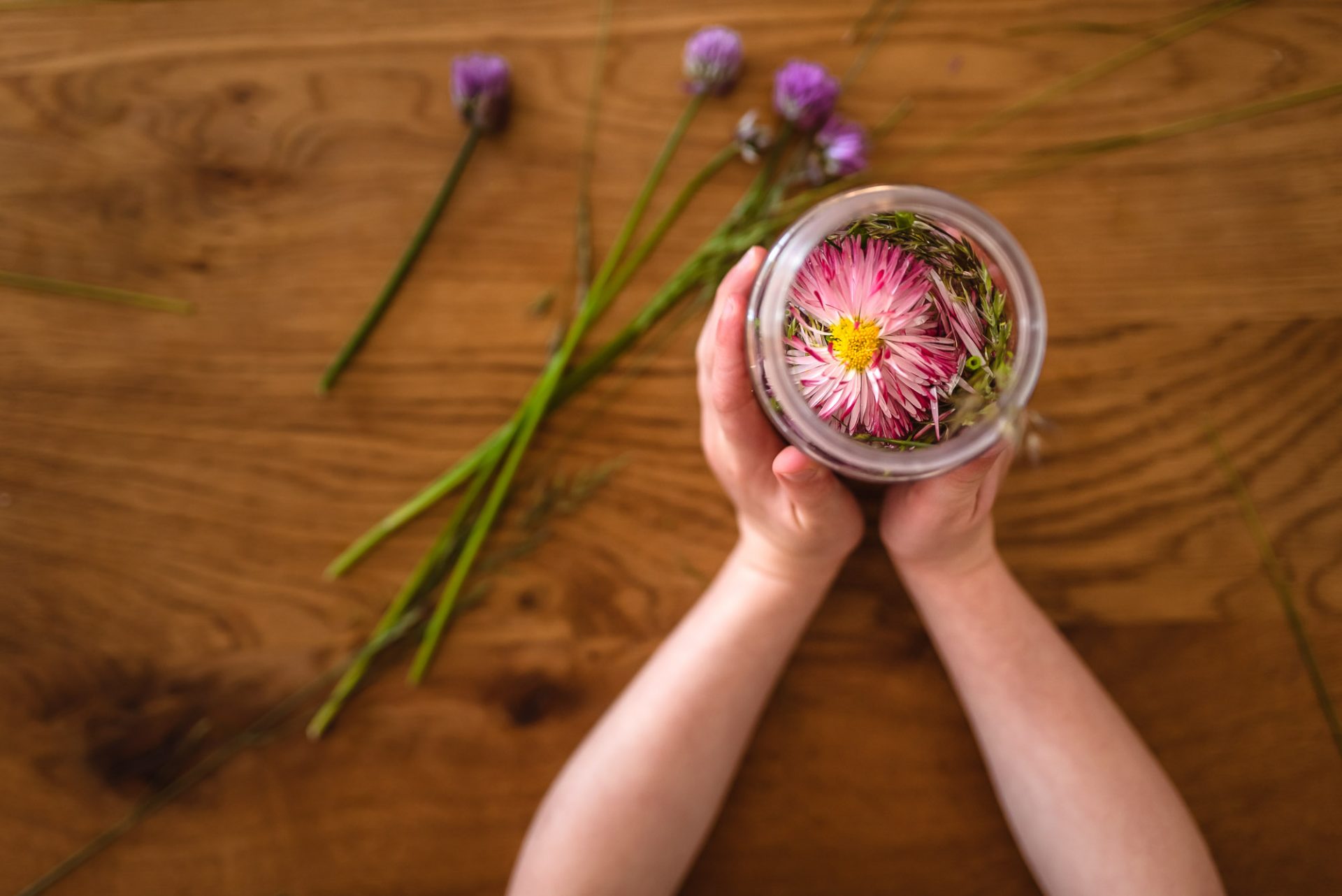
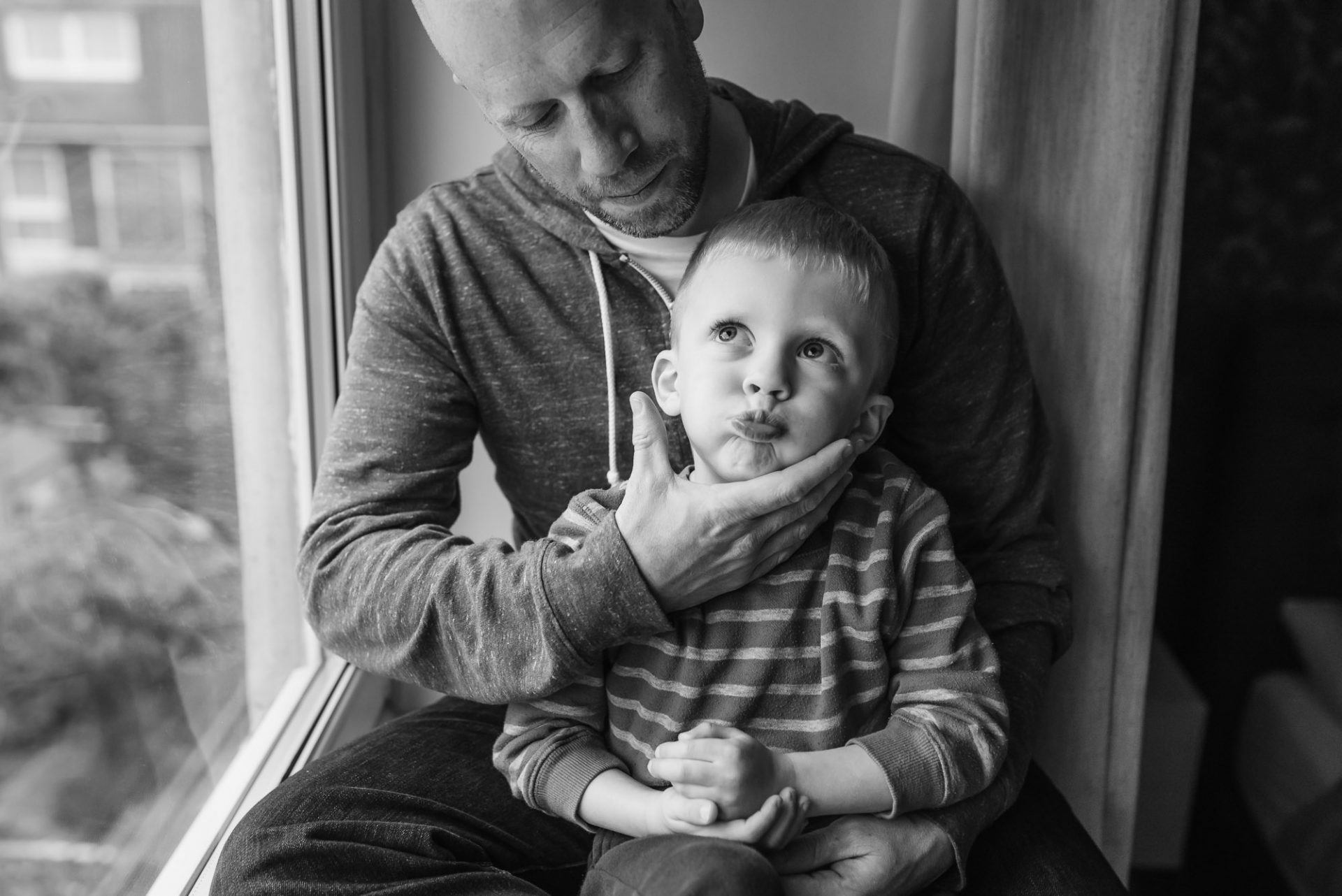
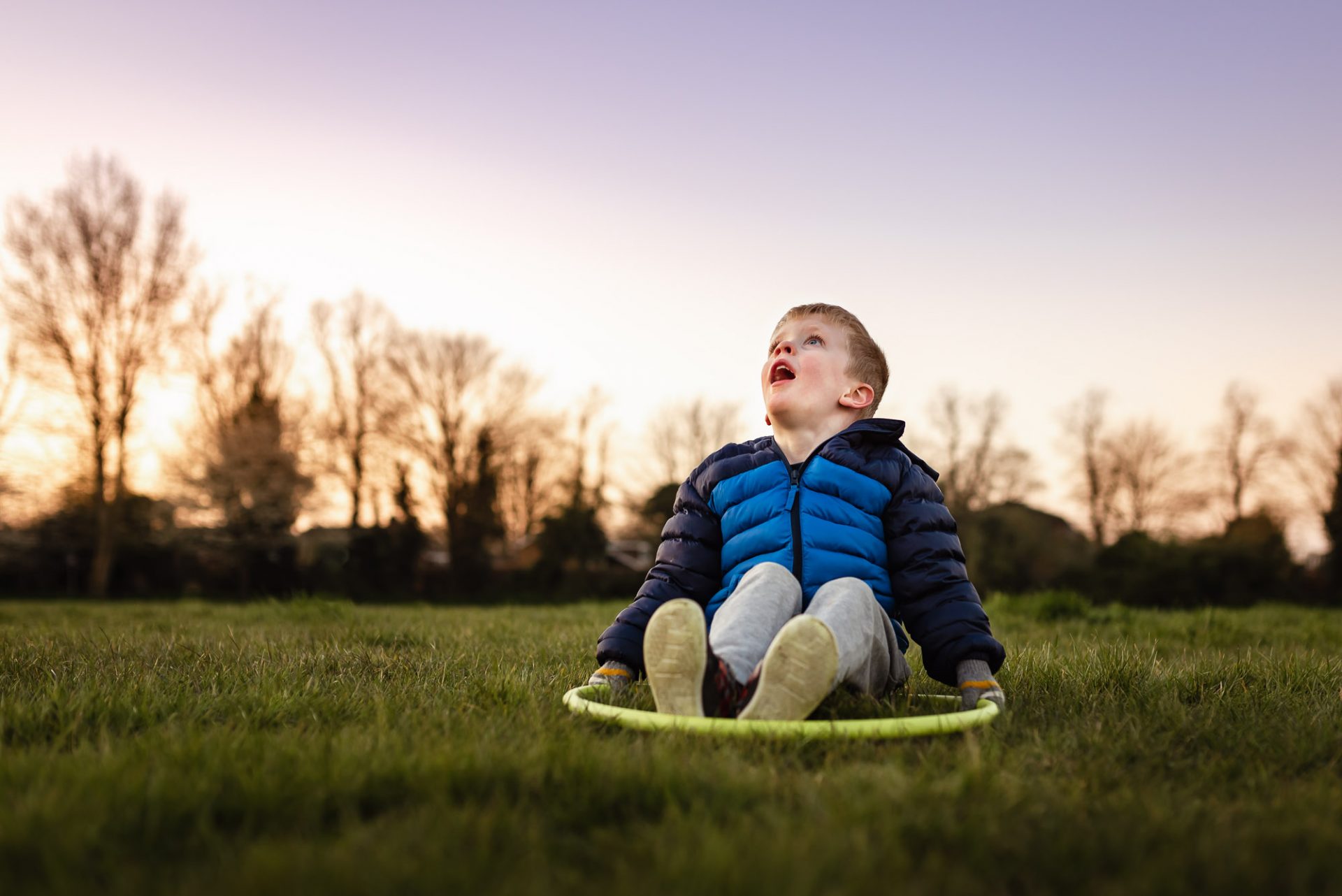
Examples of the rule of thirds:
Voila
I hope this was helpful and you feel inspired to give editing a go. The more you edit the better you’ll get at spotting what adjustments are needed.
As Ansel Adams said: “You don’t take a photograph, you make it.”
Don’t forget to keep sharing your work with me on Facebook. I love seeing your photos.